

Hình 1: Housing owned and rented in the UK
Website: ielts-fighter.com | Fanpage: 30 ngày chinh phục 6.5 IELTS
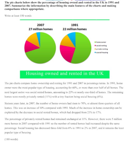
The pie charts below show the percentage of housing owned and rented in the UK in 1991 and 2007. Summarize the information by describing the main features of the charts and making comparisons where appropriate.
Write at least 150 words
(Biểu đồ tròn 2007: 27 million homes)
(Biểu đồ tròn 1991: 22 million homes)
Legend:
- home owner
- social renting
- private renting
- social housing
Housing owned and rented in the UK
The pie charts compare home ownership and renting for 1991 and 2007 in percentage terms. In 1991, home owner were the most popular type of housing, accounting for 60%, or more than over half of all homes. The next largest sector was social rented homes, amounting to 23% or nearly one-third of homes. The remaining homes were mostly privately rented (11%) with a tiny fraction being social housing (6%).
Sixteen years later, in 2007, the number of home owners had risen to 70%, or almost three quarters of all homes. This was an increase of 10% compared with 1991. Much of the increase in home ownership can be explained by the decrease in social rented homes, which had dropped from 23% to 17%.
The percentage of privately rented homes had remained unchanged at 11%. However, there were 5 million more homes in 2007 compared with 1991 so the number of rented homes had increased despite the same percentage. Social housing has decreased three-fold from 6% in 1991 to 2% in 2007, and it remains the least popular type of housing.
(180 words)
Hình 2: Drinking habits by age (US)
Website: ielts-fighter.com | Fanpage: 30 ngày chinh phục 6.5 IELTS
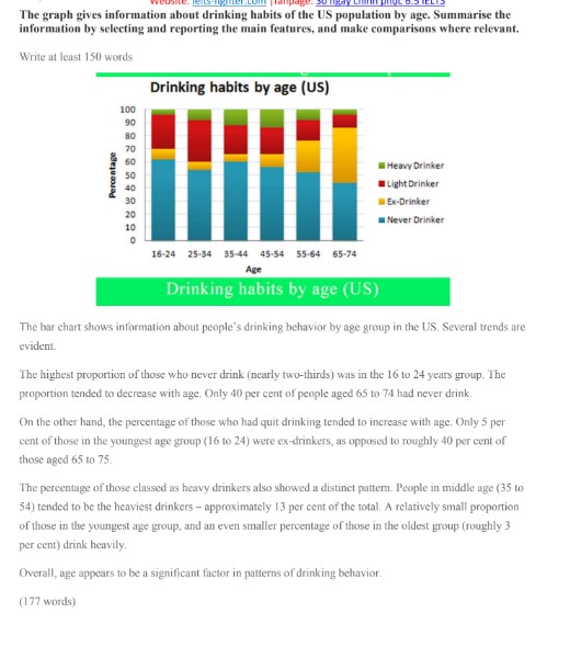
The graph gives information about drinking habits of the US population by age. Summarise the information by selecting and reporting the main features, and make comparisons where relevant.
Write at least 150 words
(Biểu đồ cột chồng – Drinking habits by age (US))
Legend (từ trên xuống dưới):
- Heavy Drinker
- Light Drinker
- Ex-Drinker
- Never Drinker
Age groups: 16-24, 25-34, 35-44, 45-54, 55-64, 65-74
Drinking habits by age (US)
The bar chart shows information about people’s drinking behavior by age group in the US. Several trends are evident.
The highest proportion of those who never drink (nearly two-thirds) was in the 16 to 24 years group. The proportion tended to decrease with age. Only 40 per cent of people aged 65 to 74 had never drink.
On the other hand, the percentage of those who had quit drinking tended to increase with age. Only 5 per cent of those in the youngest age group (16 to 24) were ex-drinkers, as opposed to roughly 40 per cent of those aged 65 to 75.
The percentage of those classed as heavy drinkers also showed a distinct pattern. People in middle age (35 to 54) tended to be the heaviest drinkers – approximately 13 per cent of the total. A relatively small proportion of those in the youngest age group, and an even smaller percentage of those in the oldest group (roughly 3 per cent) drink heavily.
Overall, age appears to be a significant factor in patterns of drinking behavior.
(177 words)
Hình 3: Average YouTube Video ad length and time viewed
The table shows the average length of YouTube video advertisements and average length of time viewers spend watching them. Summarise the information by selecting and reporting the main features.
Write at least 150 words
Average YouTube Video ad length and time viewed
| Type of YouTube ad | Average length of YouTube ad (seconds) | Average time viewed (seconds) |
| Public service | 66.7 | 28.1 |
| Business and finance | 35.1 | 24.6 |
| Entertainment and news | 30.8 | 26.5 |
| Travel | 28.7 | 23.0 |
| Technology | 39.3 | 20.9 |
| Retail | 26.5 | 20.1 |
| Consumer electronics | 24.9 | 17.3 |
| Clothing | 23.4 | 16.6 |
| Pharmaceuticals | 21.8 | 16.0 |
| Lifestyle | 33.7 | 14.3 |
| Overall | 38.1 | 20.4 |
The table shows the average length of YouTube video advertisements by sector and average length of time viewers spent watching these advertisements.
The average length of the advertisements varied from a low of 21.8 seconds for pharmaceuticals to a high of 66.7 for public service advertisements. With the exception of government- and technology-related advertisements, in general, products and services which required a large financial commitment tended to have longer advertisements. Entertainments, financial services and travel advertisements, for example, were all over twenty eight seconds on average or longer. Less expensive products, on the other hand, such as consumer electronics, clothing and medicines, tended to have shorter advertisements.
Adverts for more expensive products or services also tended to be watched for longer than adverts for less expensive items. Viewers on average watched more than 50 per cent of advertisements for entertainment, travel, business and finance. In contrast, viewers tended to watch less of government advertisements and advertisements for cheaper goods such as consumer electronics, clothing and medicines.
Overall, length of YouTube video advertisements and length of time spent viewing such advertisements appears to be associated with the perceived cost of the product or service being advertised.
(195 words)
Hình 4: Research students studying six computer science subjects at a US university in 2011
The bar graph below shows the numbers of male and female research students studying six computer science subjects at a US university in 2011. Summarise the information by selecting and reporting in the main features, and make comparisons where relevant.
Write at least 150 words
(Biểu đồ cột – Research students studying six computer science subjects at a US university in 2011)
Legend:
- Female (màu hồng)
- Male (màu xanh lá)
Subjects (từ trên xuống dưới):
- linguistics
- psychology
- natural sciences
- engineering
- programming
- mathematics
Research students studying six computer science subjects at a US university in 2011
The bar chart shows the gender distribution of students doing computer scientific research across a range of disciplines at a US university in 2011.
In five of the six disciplines, males outnumbered females. Male students made up a particularly large proportion of the student group in subjects related to the study of programming objects: mathematics, programming, and engineering. The gender gap was particularly large in the field of mathematics, where there were five times as many male students as female students.
Men and women were more equally represented in subjects related to the study of computer science: natural sciences, psychology, and linguistics. In natural science, there were nearly as many women (approximately 200) as men (approximately 240). This was also true of psychology. Linguistics was the only discipline in which women outnumbered men [roughly 110 women vs. 90 men].
Overall, the chart shows that at this university, computer science subjects continue to be male-dominated; however, women have a significant presence in fields related to psychology and the computer sciences.
(169 words)
Hình 5: The average consumption of food
The pie charts show the average consumption of food in the world in 2008 compared to two countries; China and India. Write a report to a university lecturer describing the data.
Write at least 150 words
(Biểu đồ tròn – The average consumption of food)
Legend:
- Processed food (màu xanh dương)
- Vegetables and fruits (màu xanh lá)
- Animal food (màu vàng)
- Nuts and seeds (màu đỏ)
World (tổng 100%)
- Processed food: 41%
- Vegetables and fruits: 29%
- Animal food: 26%
- Nuts and seeds: 4%
China
- Processed food: 34%
- Vegetables and fruits: 32%
- Animal food: 19%
- Nuts and seeds: 15%
India
- Processed food: 39%
- Vegetables and fruits: 23%
- Animal food: 27%
- Nuts and seeds: 11%
The average consumption of food
The graphs illustrate the consumption of 4 types of food used in the word in 2008. The figures are compared to the amounts of food used in China and India in the same year.
As an overall trend, the two countries showed different food consumption from the world average, while processed food consumption still had the largest percentages in all the three charts.
In particular, processed food consumption was the highest in the world, accounting for 41%, which was followed by vegetables and fruits at 29% and animal food at a quarter. Only 4% consisted of nut and seeds consumption.
(The provided text cuts off here, but the summary based on the chart would continue with comparisons for China and India).