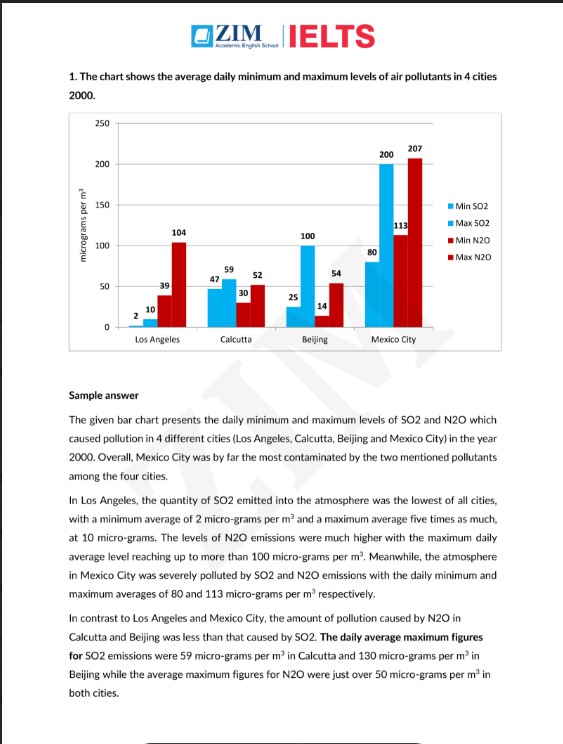


1. The chart shows the average daily minimum and maximum levels of air pollutants in 4 cities 2000.
(biểu đồ cột cho thấy mức trung bình ngày tối thiểu và tối đa của các chất ô nhiễm không khí ở 4 thành phố năm 2000.)
Sample answer
the given bar chart presents the daily minimum and maximum levels of so2 and n2o which caused pollution in 4 different cities (los angeles, calcutta, beijing and mexico city) in the year 2000. overall, mexico city was by far the most contaminated by the two mentioned pollutants among the four cities.
in los angeles, the quantity of so2 emitted into the atmosphere was the lowest of all cities, with a minimum average of 2 micro-grams per
m3\text{m}^3m3
and a maximum average five times as much, at 10 micro-grams. the levels of n2o emissions were much higher with the maximum daily average level reaching up to more than 100 micro-grams per
m3\text{m}^3m3
. meanwhile, the atmosphere in mexico city was severely polluted by so2 and n2o emissions with the daily minimum and maximum averages of 80 and 113 micro-grams per
m3\text{m}^3m3
respectively.
in contrast to los angeles and mexico city, the amount of pollution caused by n2o in calcutta and beijing was less than that caused by so2. the daily average maximum figures for so2 emissions were 59 micro-grams per
m3\text{m}^3m3
in calcutta and 130 micro-grams per
m3\text{m}^3m3
in beijing while the average maximum figures for n2o were just over 50 micro-grams per
m3\text{m}^3m3
in both cities.
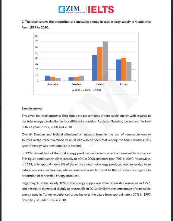
2. The chart shows the proportion of renewable energy in total energy supply in 4 countries from 1997 to 2010.
(biểu đồ cột cho thấy tỷ lệ năng lượng tái tạo trong tổng nguồn cung năng lượng ở 4 quốc gia từ năm 1997 đến 2010.)
Sample answer
the given bar chart presents data about the percentages of renewable energy with regards to the total energy production in four different countries (australia, sweden, iceland and turkey) in three years; 1997, 2000 and 2010. overall, sweden and iceland witnessed an upward trend in the use of renewable energy sources in the three examined years. it can also be seen that among the four countries, this type of energy was most popular in iceland.
in 1997, almost half of the total energy produced in iceland came from renewable resources. this figure continued to climb steadily to 60% in 2000 and more than 70% in 2010. meanwhile, in 1997, only approximately 5% of the entire amount of energy produced was generated from natural resources in sweden, who experienced a similar trend to that of iceland in regards to proportion of renewable energy produced.
regarding australia, nearly 10% of the energy supply was from renewable resources in 1997, and this figure decreased slightly to around 5% in 2010. similarly, the percentage of renewable energy used in turkey experienced a decline over the years from approximately 37% in 1997 down to just under 35% in 2010.
3. The charts show the sources of electricity produced in 4 countries between 2003 and 2008. Summarise the information by selecting and reporting the main features, and make comparisons where relevant.
(các biểu đồ tròn cho thấy các nguồn sản xuất điện ở 4 quốc gia trong khoảng thời gian từ 2003 đến 2008. tóm tắt thông tin bằng cách chọn và báo cáo các đặc điểm chính, đồng thời đưa ra so sánh khi thích hợp.)
Có thể bạn cũng muốn đọc thêm các cuốn sách sau:
Sample answer
the given pie charts detail information about the proportion of three different sources of electricity in four countries (india, sweden, morocco and vietnam) from 2003 to 2008.
overall, vietnam and morocco did not use any nuclear power for electricity production. it can also be seen that while fossil fuels were the largest source of electricity supply in vietnam and india, they only occupied a relatively marginal proportion in morocco and sweden during the examined years.
in vietnam, 56% of the total amount of electricity was produced from fossil fuels, while the figure for morocco was only 5%. the rest of the electricity, in both nations, was produced solely from hydro power.
in india however, electricity from fossil fuels contributed to 82% of the entire quantity of electricity produced, which was also the highest figure for fossil fuel use among the four countries. meanwhile, fossil fuels were only responsible for 4% of the total generated electricity in sweden, with hydro power and nuclear power contributing 52% and 44% respectively.
Sample answer (cho biểu đồ tròn tiếp theo)
the given pie charts detail the proportion of australian secondary school graduates who were unemployed, employed or pursuing further education, in 1980, 1990, and 2000.
overall, from 1980 to 2000, the proportion of australian students who were employed grew, while there was a decline in both the proportion of those pursuing higher levels of education and those who were unemployed.
in 1980, half of the australian secondary school leavers chose to continue their education. after a 10-year period, this number dropped to only 38% and remained almost unchanged in 2000. meanwhile, the figures for those who were unemployment were the smallest, at only 10% in 1980, 12% in 1990, and finally dropping back down to 8% in 2000.
on the other hand, over the years australia saw an increase in the percentage of students who received a job after graduation from secondary school, from 40% in 1980 to 55% in 2000, which was the largest figure among all examined categories.
Sample answer (cho biểu đồ cột cuối)
the given bar charts indicate the proportion of money that people in france, germany and england spent on food and other products in 1998 and 2008.
overall, it can be seen that all three countries saw significant increases in the proportion of purchases of both food and other goods over the examined period.
in 1998, approximately 15% and 10% of the money french citizens spent was on foodstuffs and other goods, respectively. after 10 years, figures for both categories dramatically climbed to 40%. in germany, there was a mild increase of 5% of money spent on food, at 25% in 1998, and 30% in 2008. the figures for money spent on other goods were approximately 5% lower during the same years.
in england however, buyers spent only 10% on food in 1998 and 15% in 2008. meanwhile, the figures for money spent on other goods experienced a surge from about 8% in 1998 to 35% in 2008.
Các sách & tài liệu khác cùng chủ đề:


